Home Page Sections
The order of sections on the home page layout should be chosen with care with the following principle in mind:
- Maintain good contrast from one promo section to the next. For example, don’t have two red sections on top of one another.
Example:
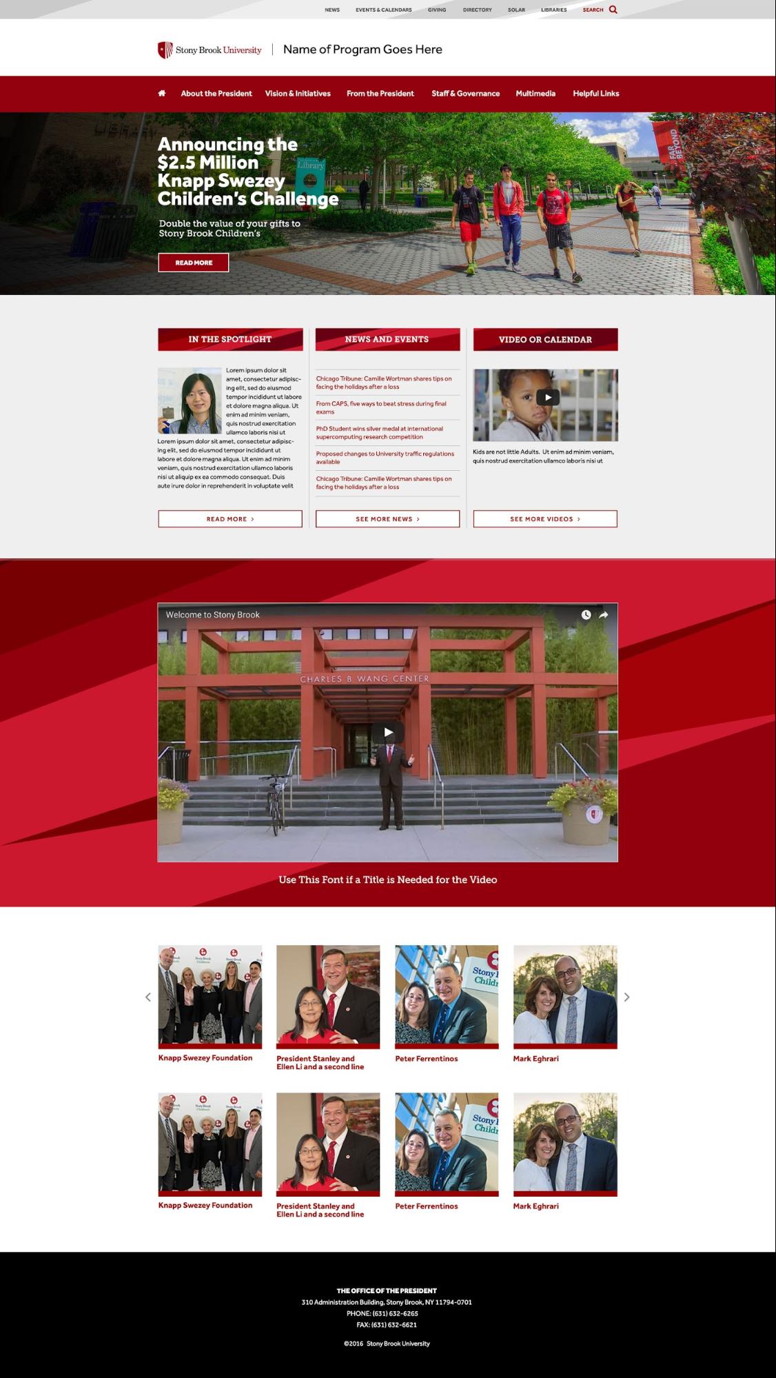
Below is an example of using sections that hold different kinds of information in a pleasing way. Each section or 'stripe' of information has good contrast between the stripe above and below it.
What not to do
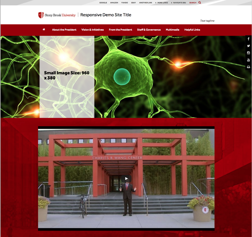
It is not recommended to have 2 stripes on top of one another, under the hero. (see below). It would be better to insert the 3 or 4 column treatment under the hero region, as shown above, or insert a shallow stripe with a contrasting background to create separation.
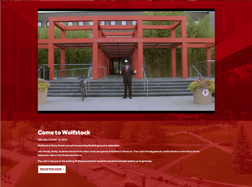
It is not recommended to have 2 red stripes placed on top of one another, or two similar color stripes (see below). Remember to provide good contrast.
Try and match content with the image
Be sure to use an image that best resembles the site's color scheme or an image that connects closely with the text used with that image. Also be aware of the contrast between the image and the color text (usually black or white) laid over that image.
Good:

Bad:

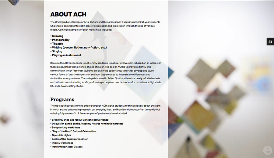
Make good use of the column space
When using certain page layout snippets, you can adjust how wide you want the columns to be, or use multiple columns. Make sure whatever you choose works with the amount of content you have, so that the information flows through the section.
The user shouldn't have to search a lot of information in a block of text. Give your section some breathing space by including padding at the top and bottom of the section. Use headers to catch the eye of the user and break up the column into digestible pieces, so the content is easy to scan and read.
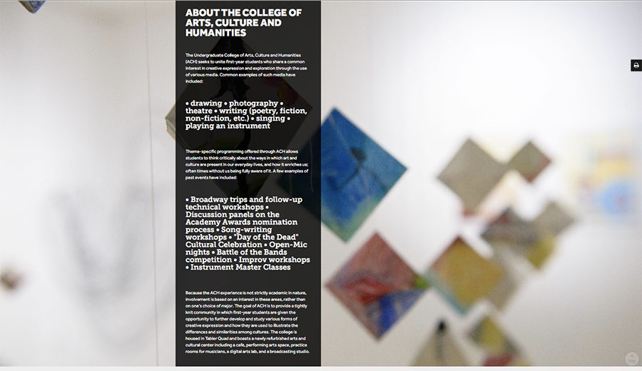
Good:
Bad:
If there is too much content in one column then the user has to scroll to find all the info and can’t scan as easily.
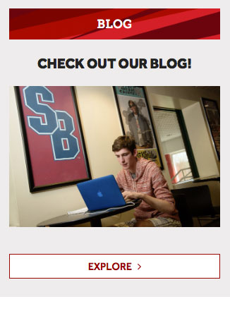
I-frames
I-frames should be used with care. We have several snippets that allow you to embed things like video without resorting to an iframe.
Also, having a frame that has its own navigation or scrolling within another section makes it difficult for the user:
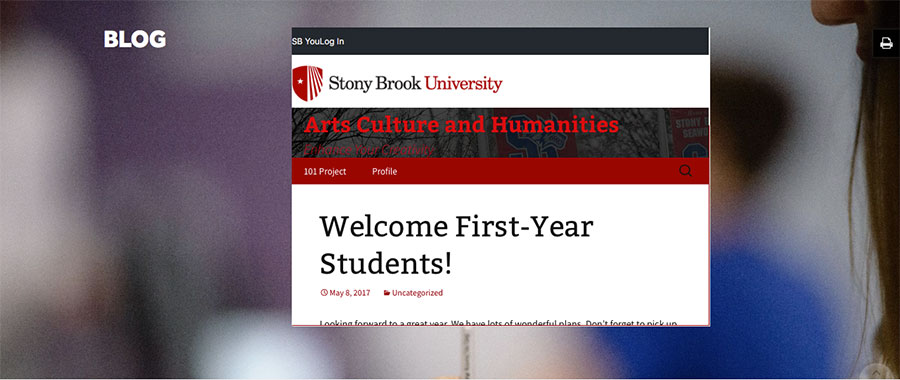
Better in this case to not pull the blog into an i-frame, but to ask the user to go to the full page to experience the page for itself: